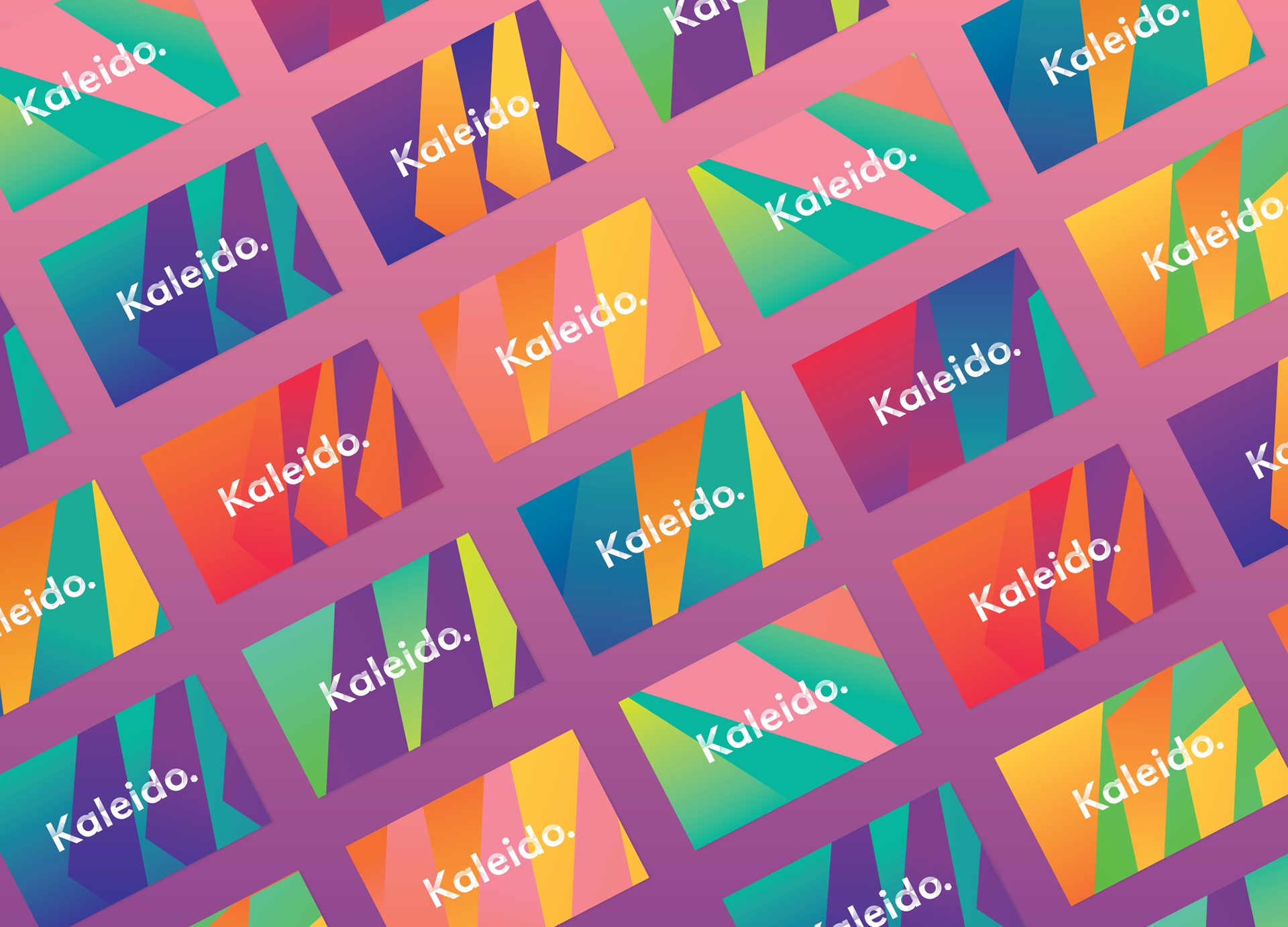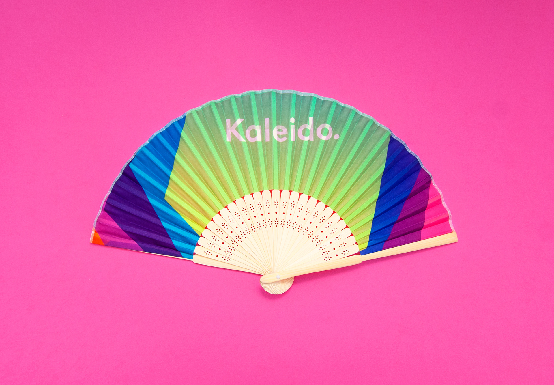

Kaleido
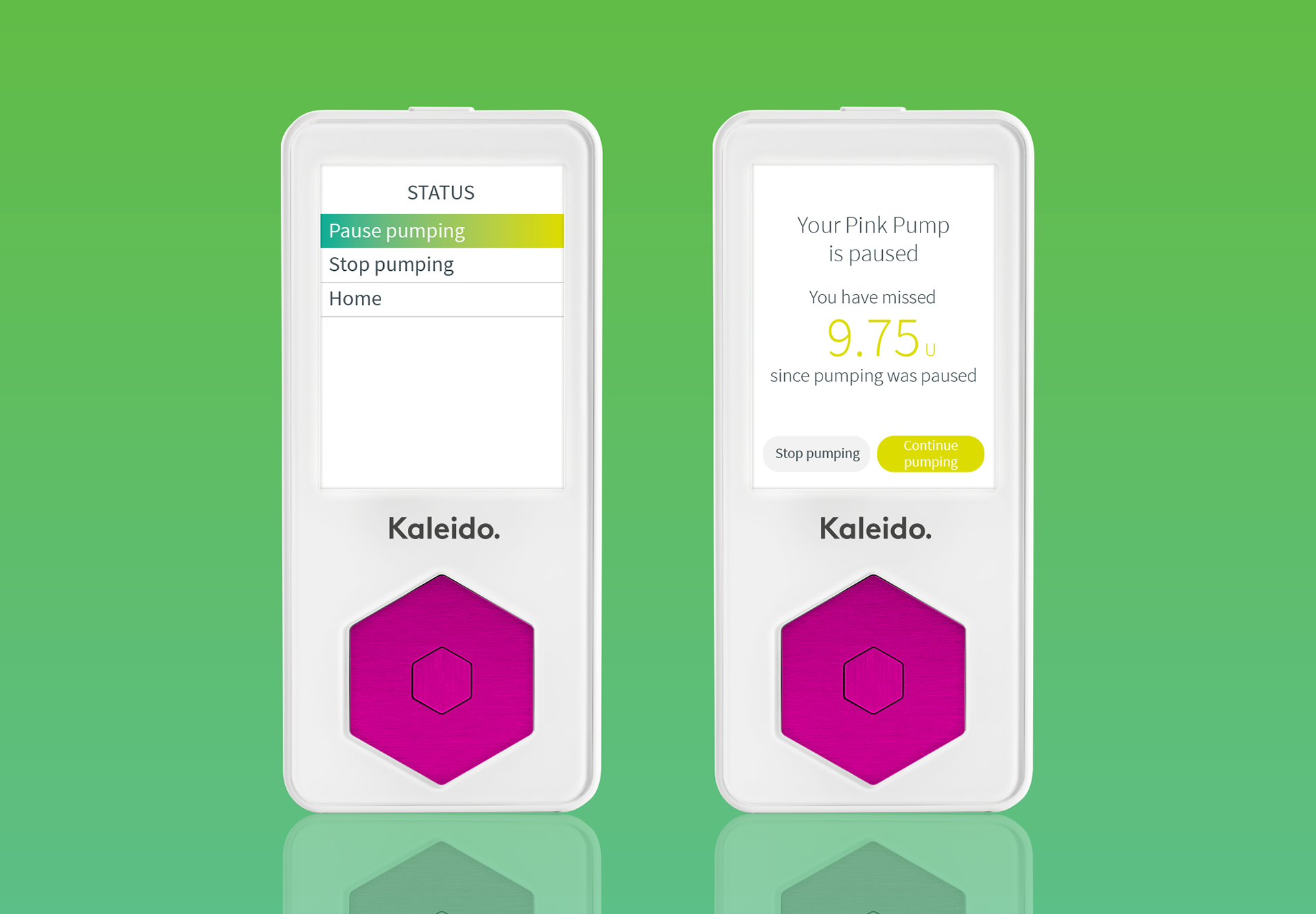
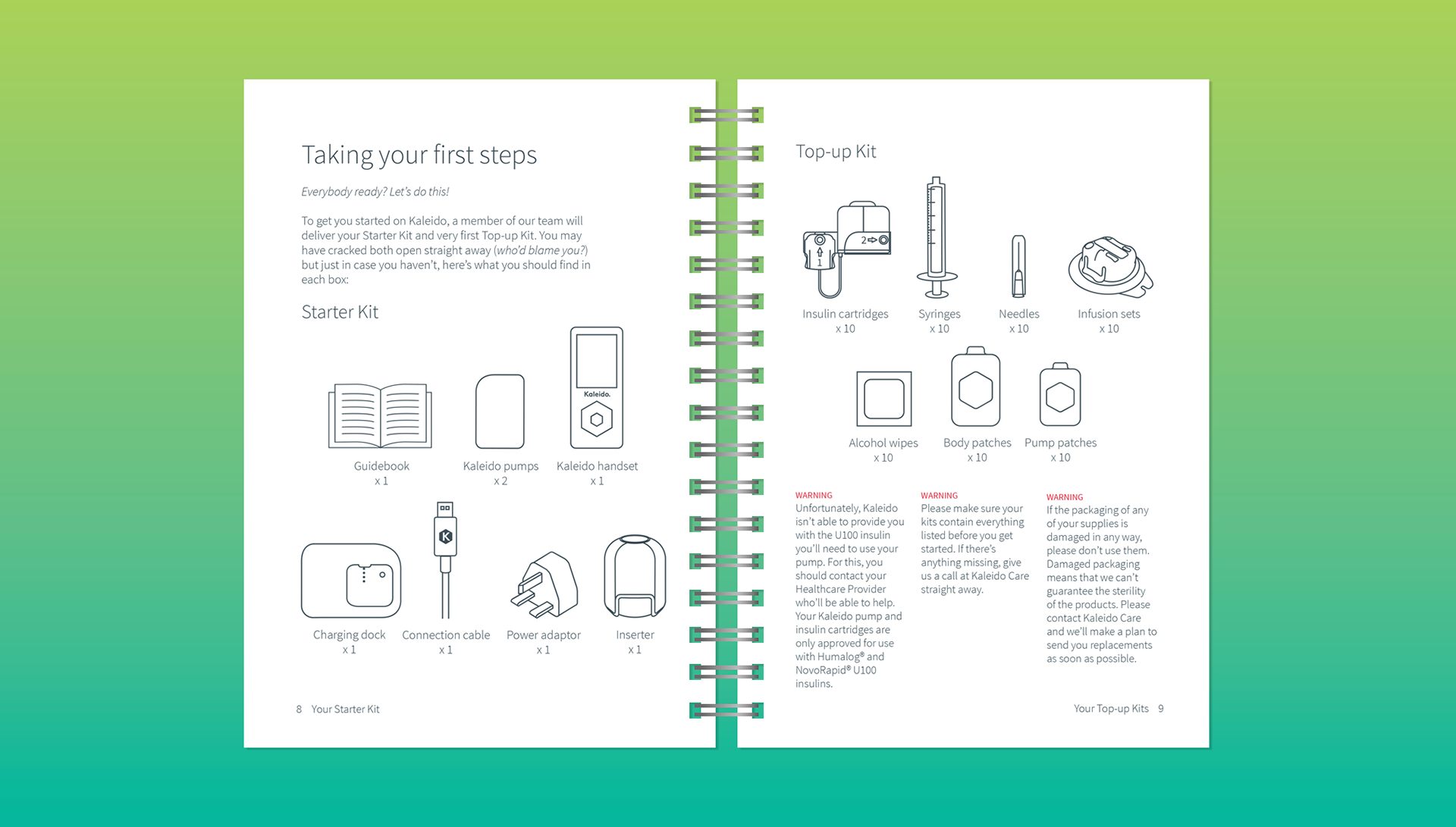
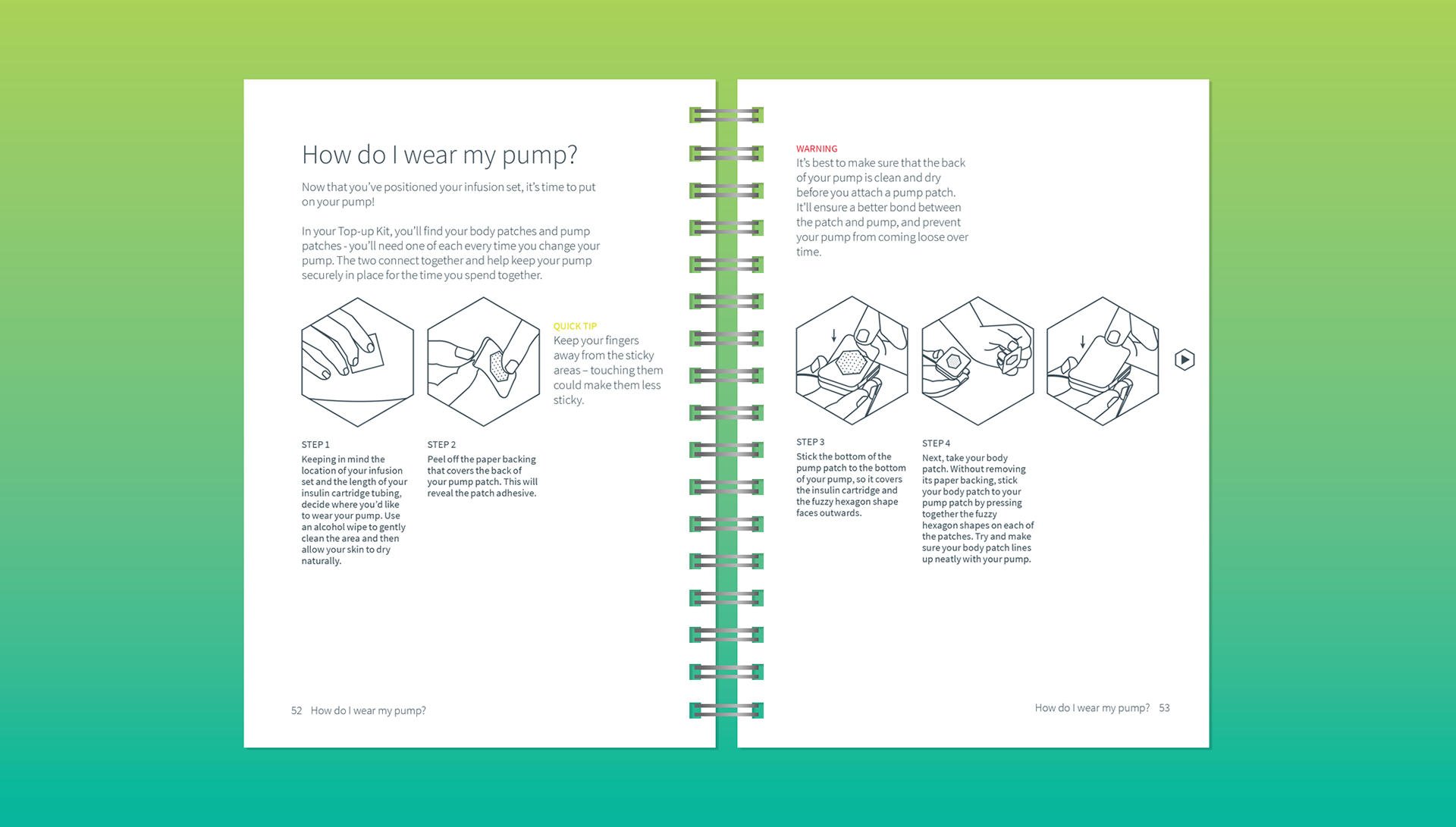
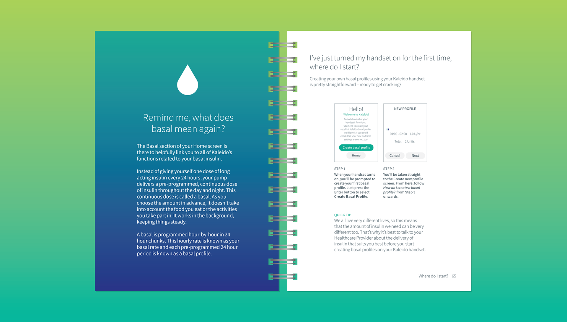
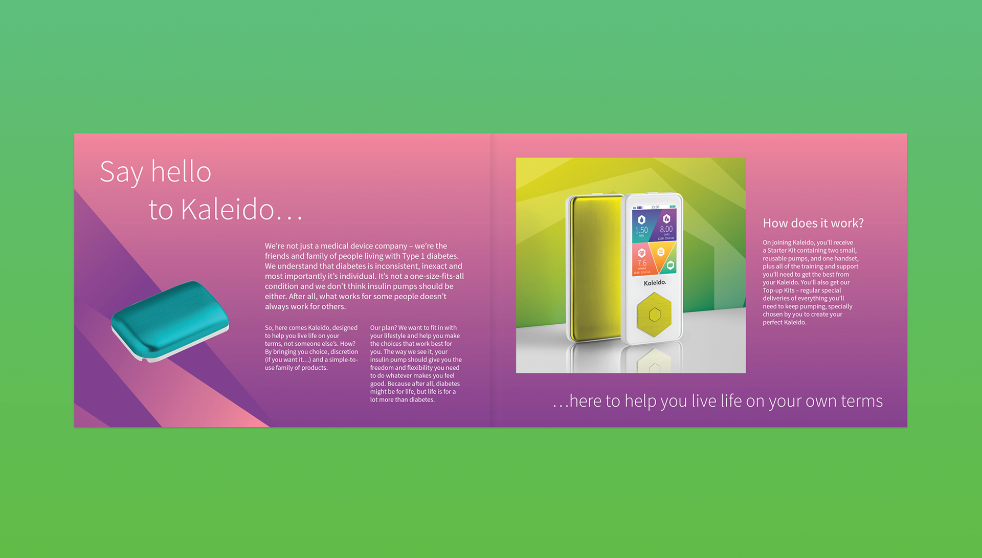
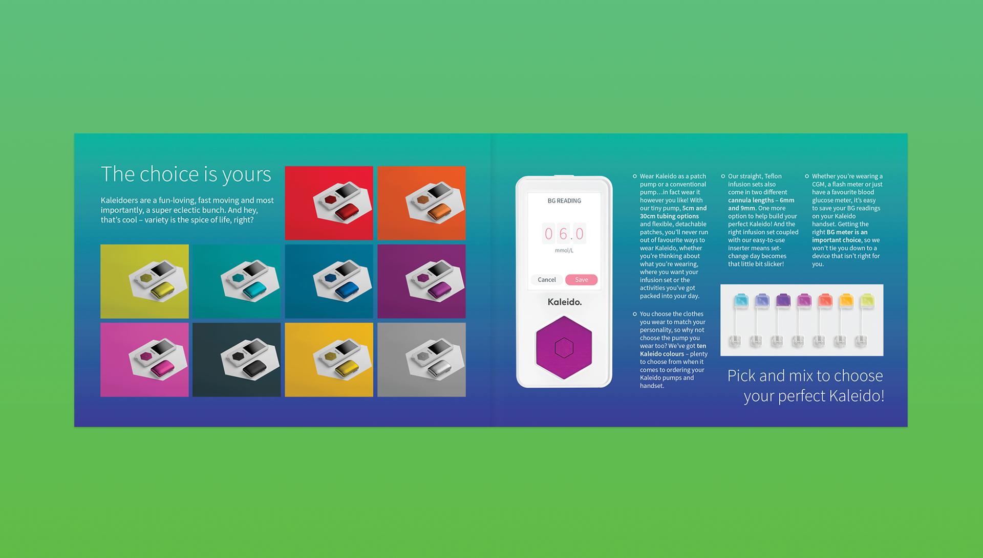
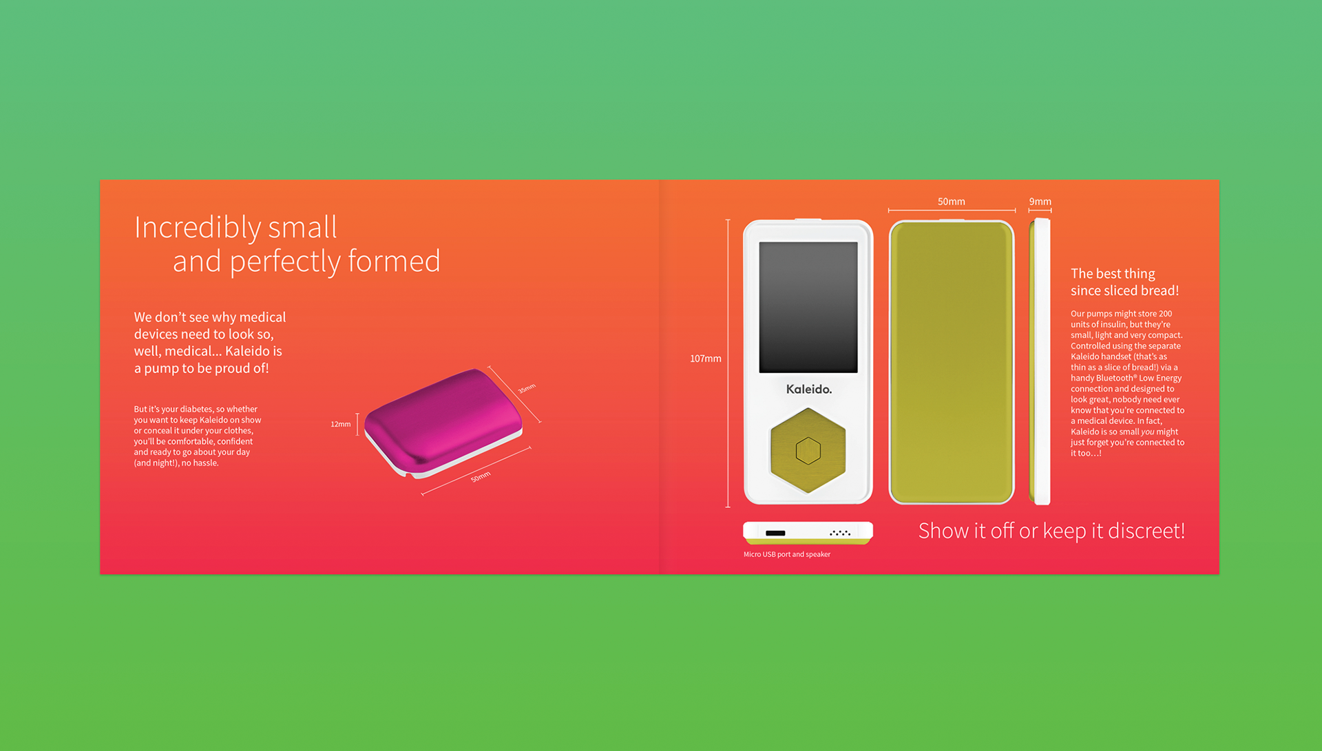
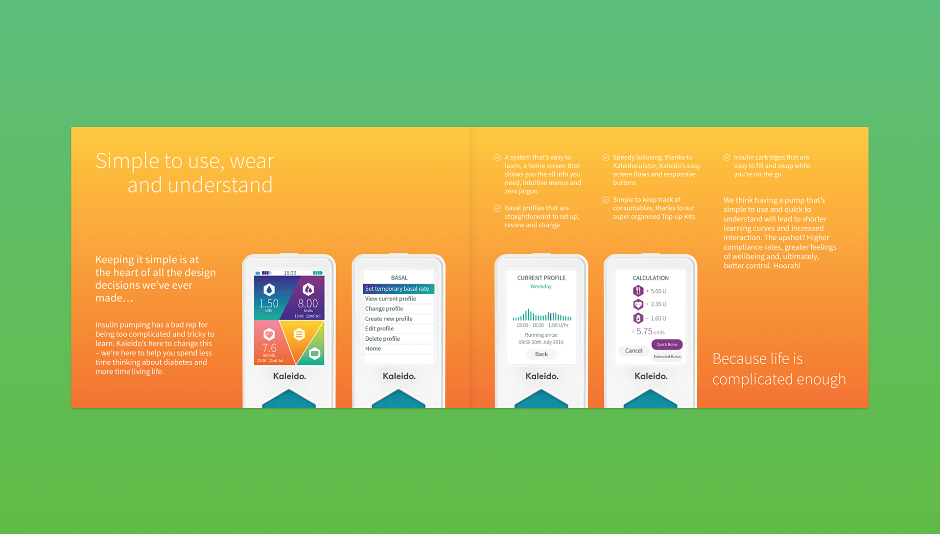
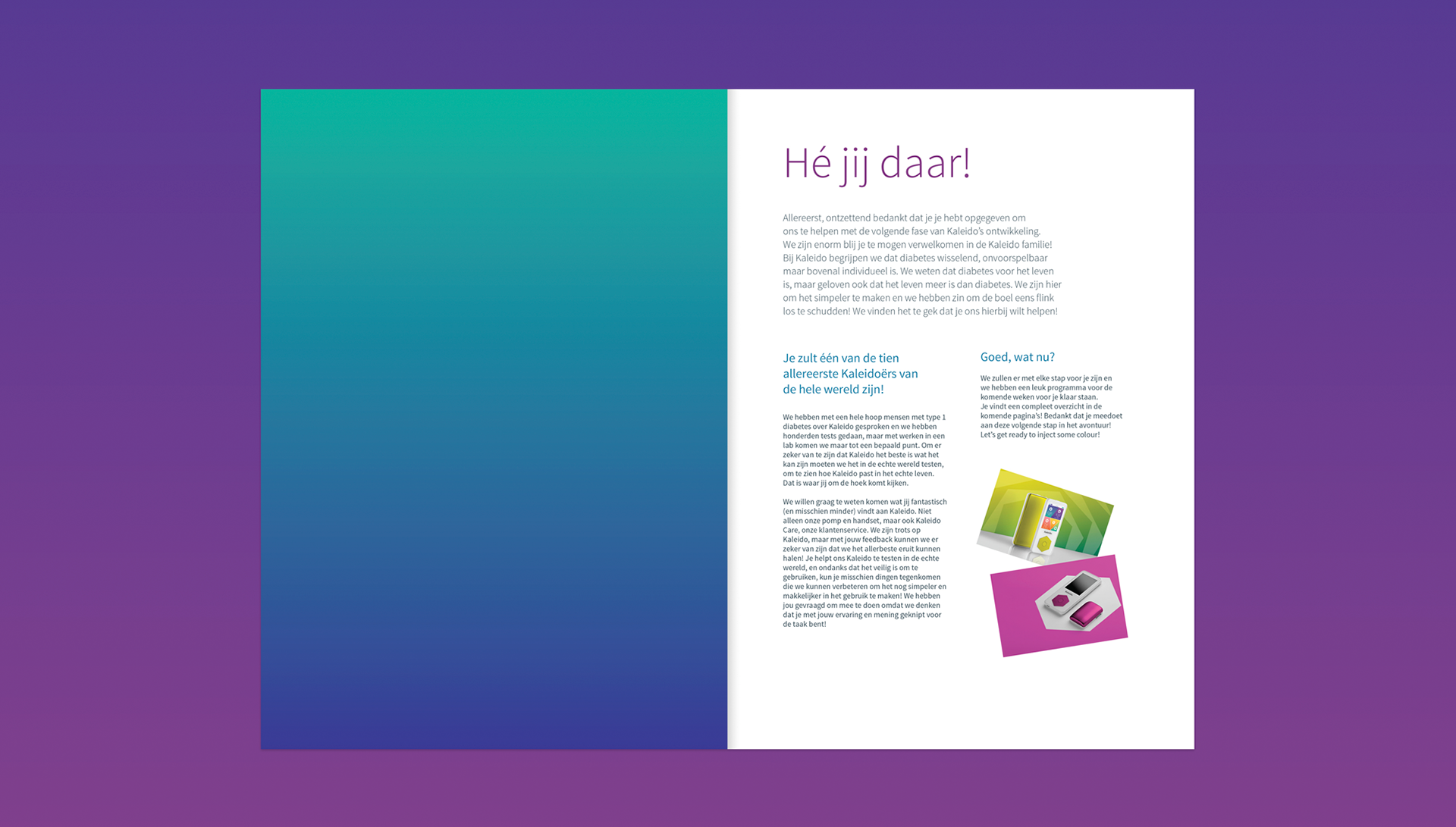
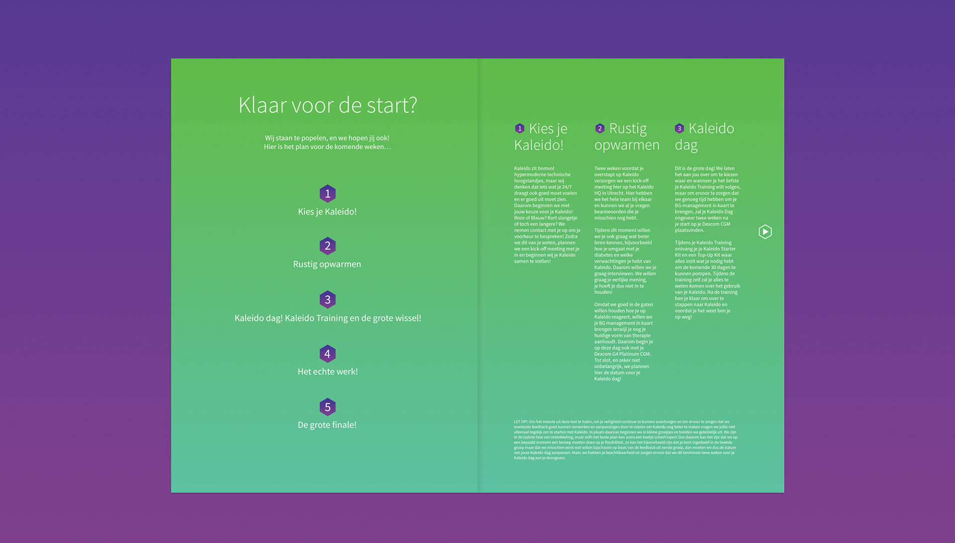
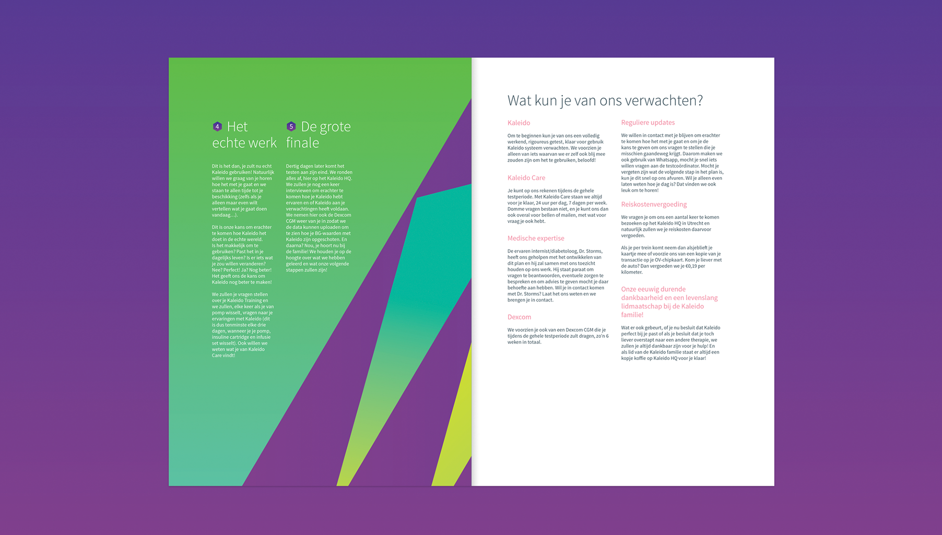
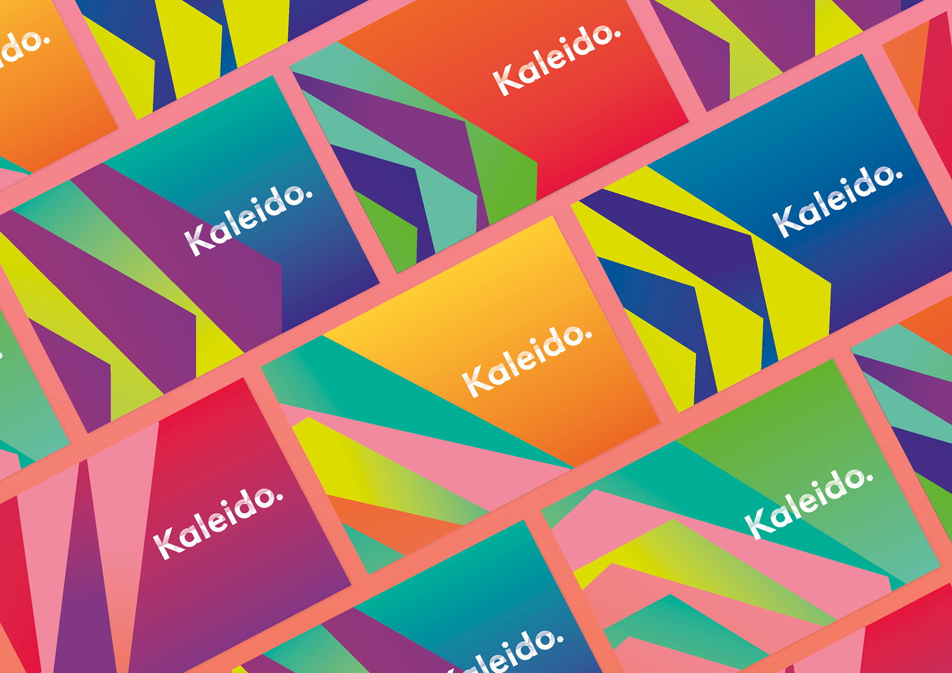
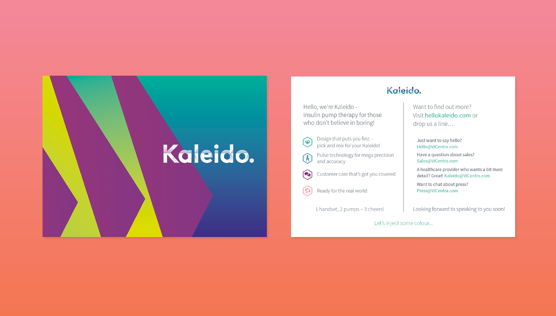
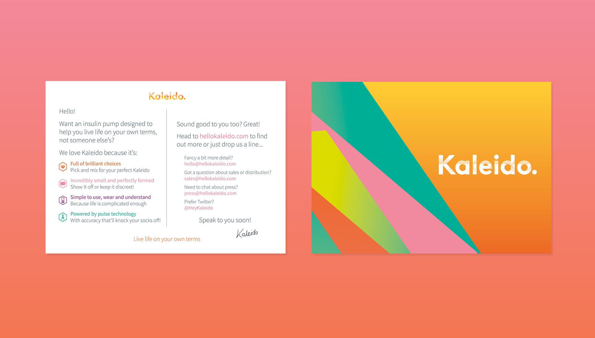
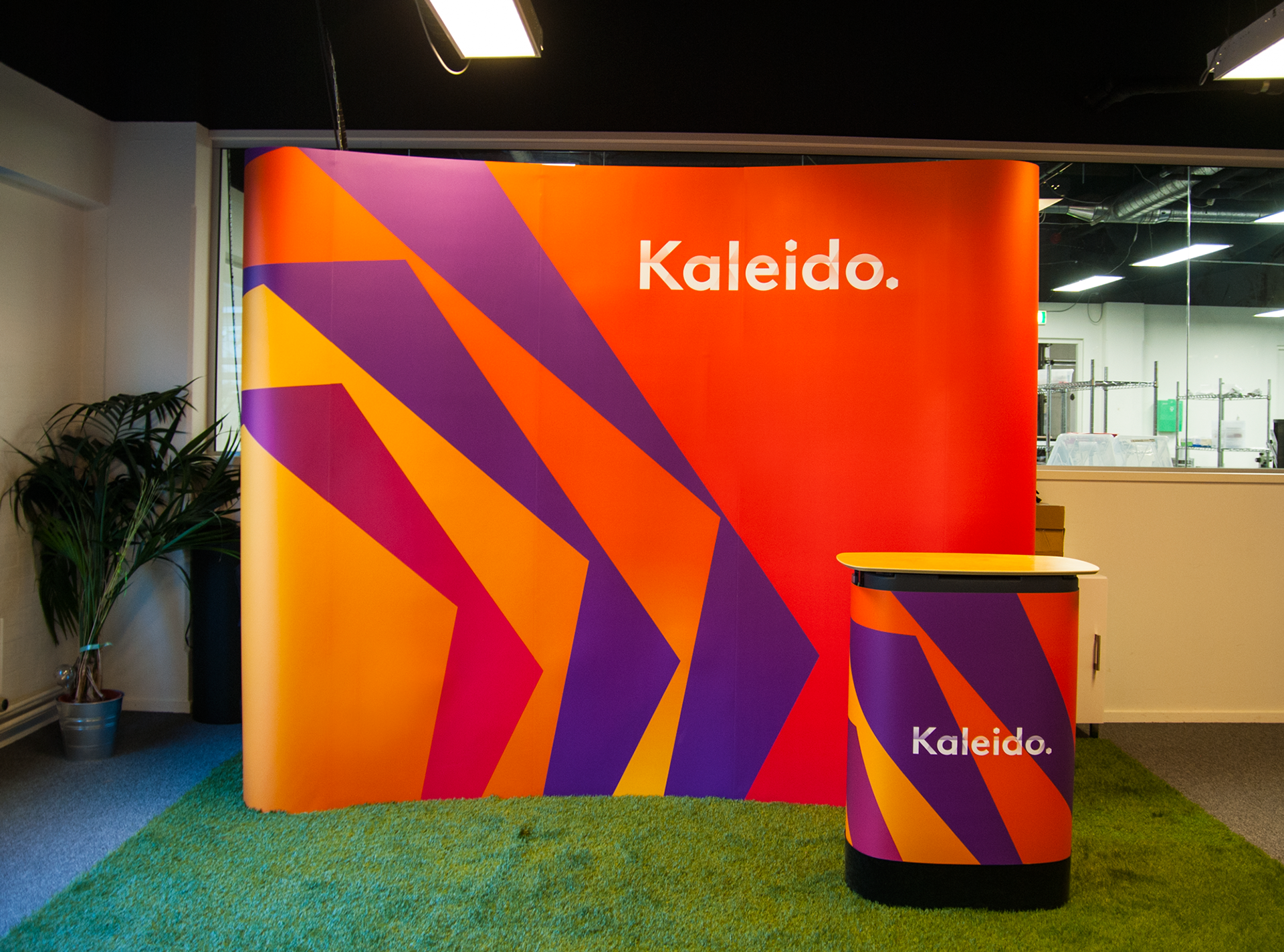
Kaleido is an insulin pump for people with type 1 diabetes - the smallest, lightest and most colourful of its kind. It is tailored for the end user rather than the healthcare industry and the entire brand experience is designed to remove the medical aspect of the product and make it more enjoyable to use. The Kaleido pumps come in 10 vibrant colours, and its small size and sleek design gives the flexibility to either wear it discretely under clothes or to show it off and match it with your outfit. It's super simple to use and understand, to help people spend less time thinking about their diabetes.
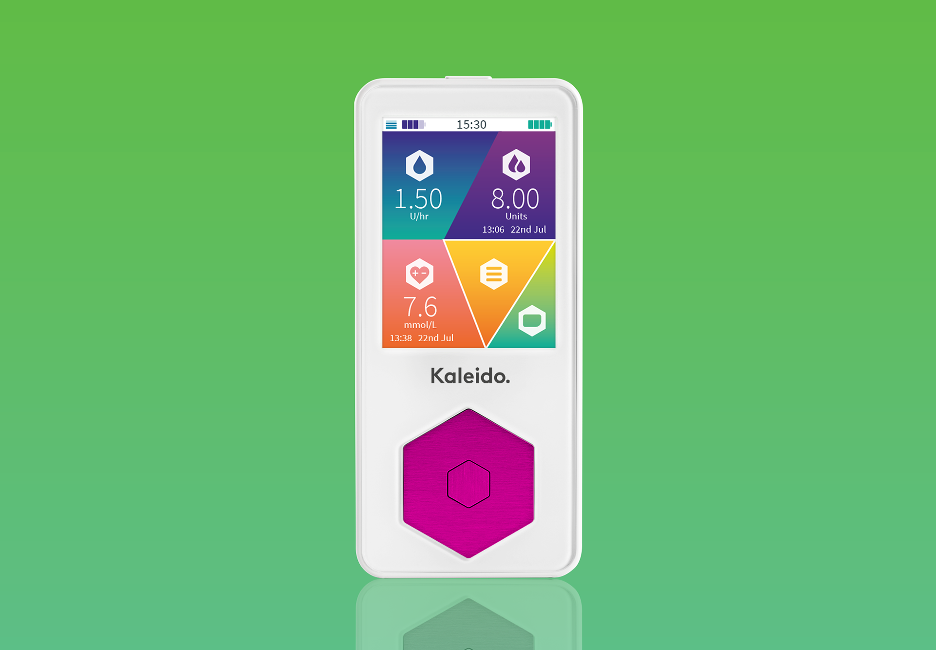
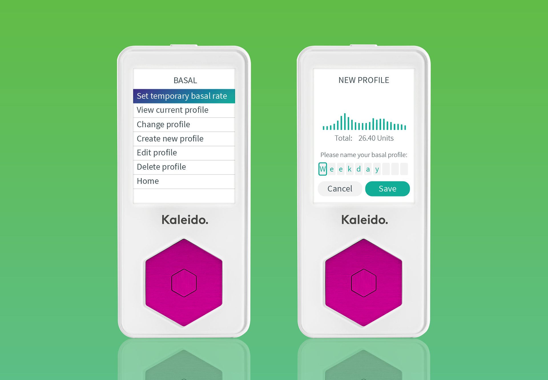
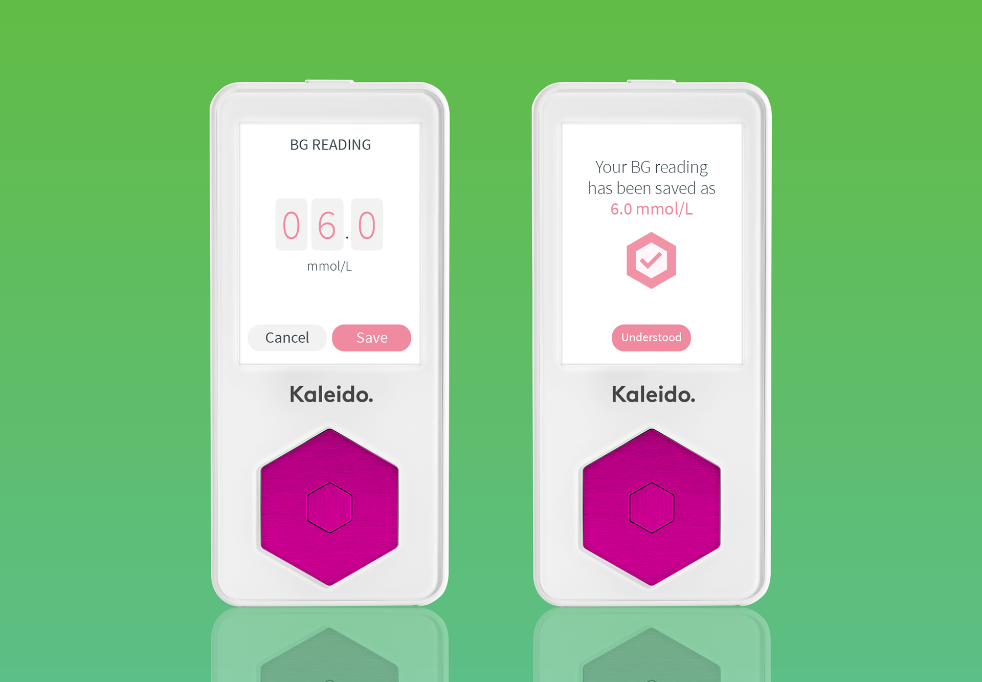
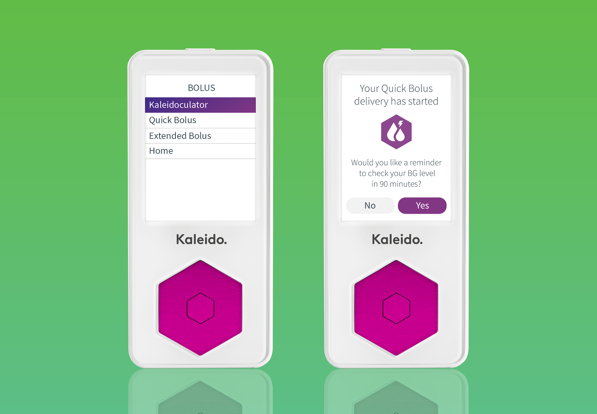
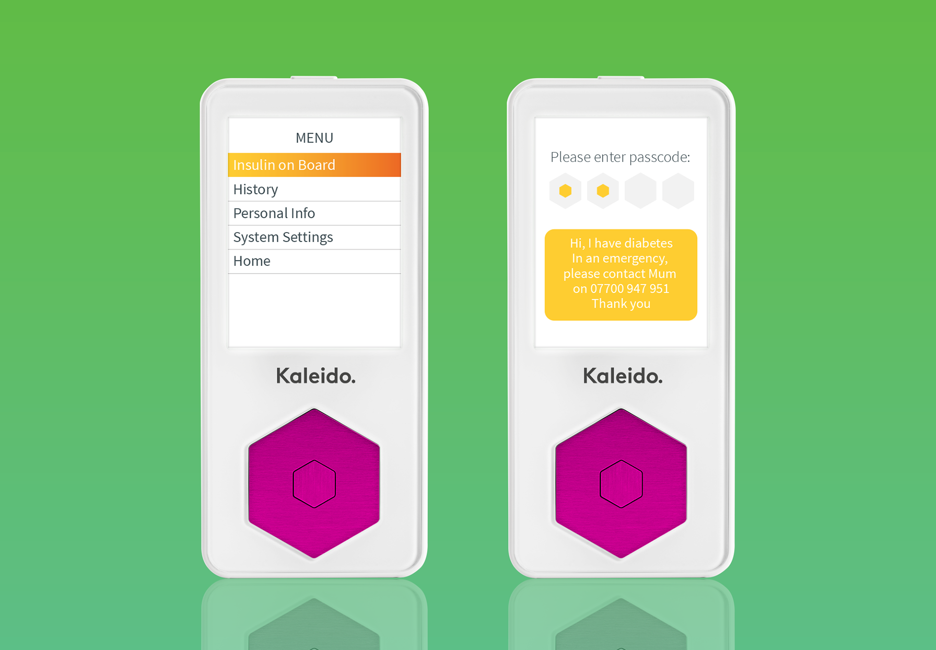
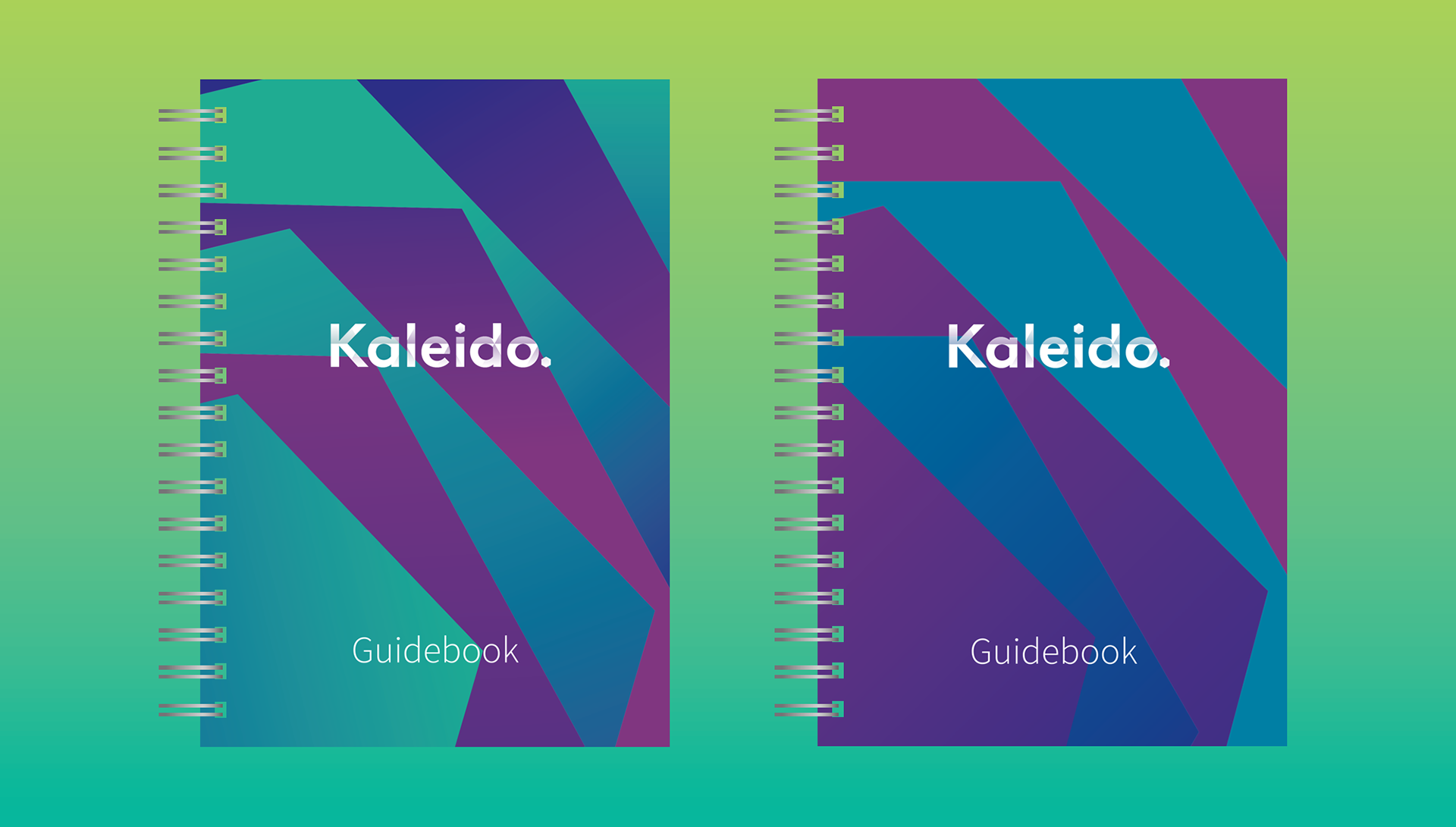
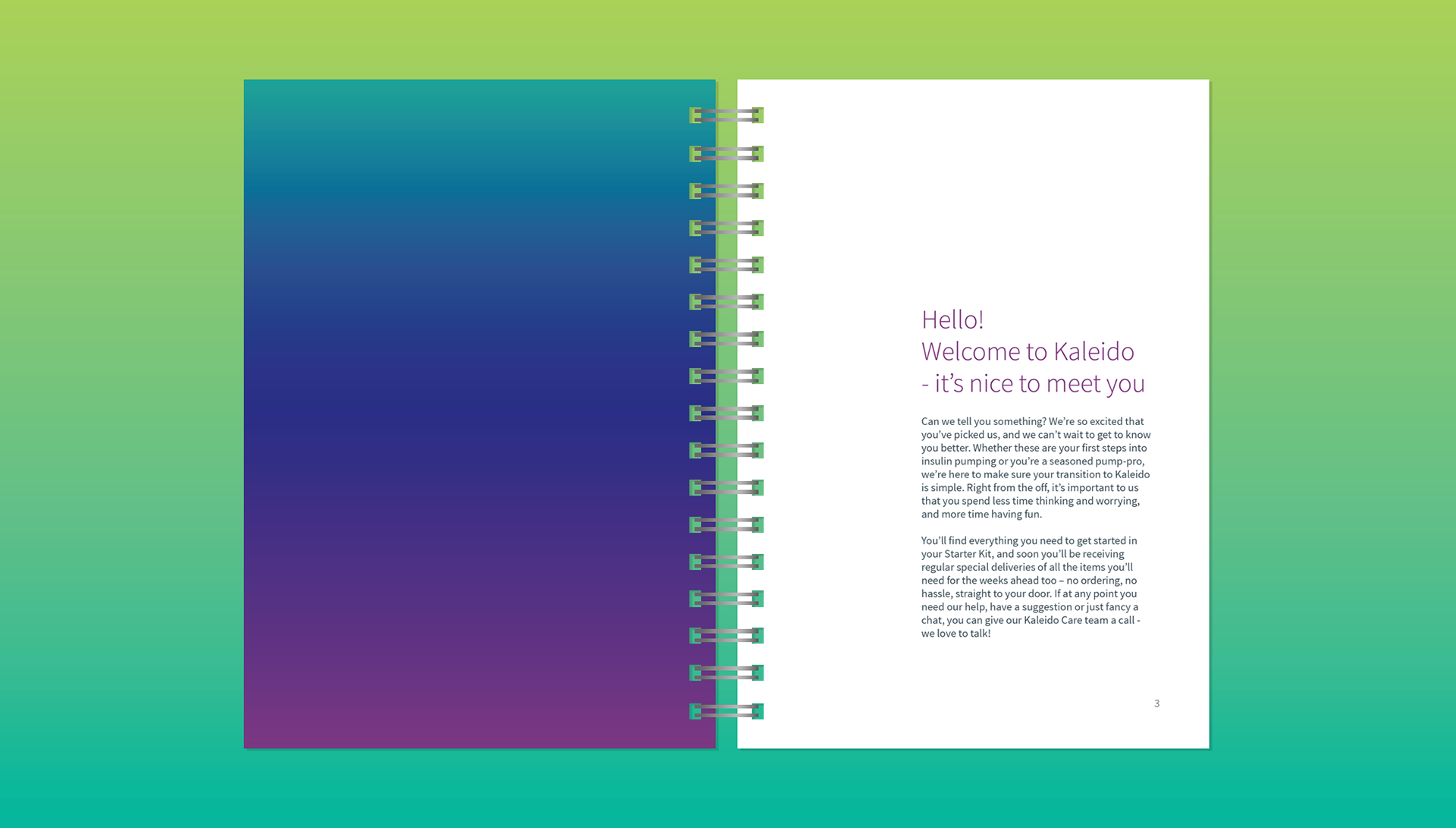
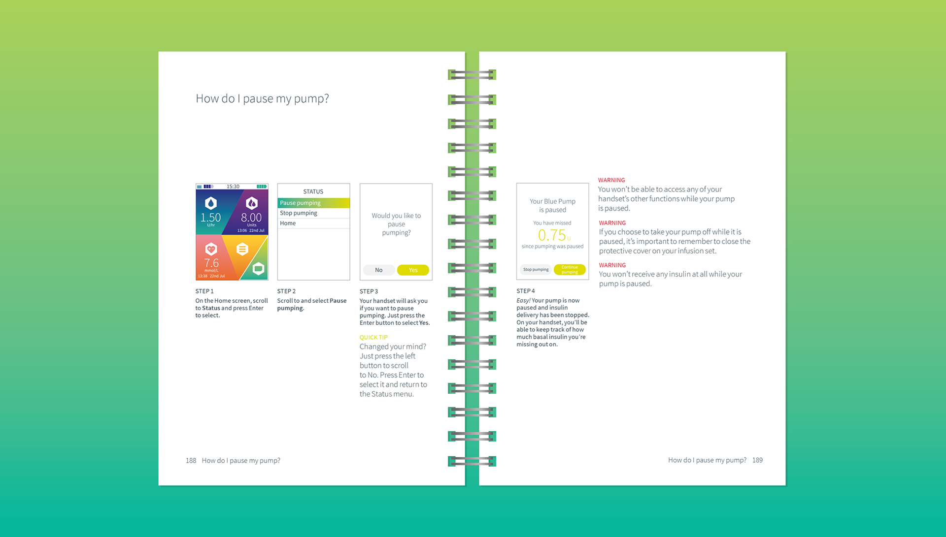
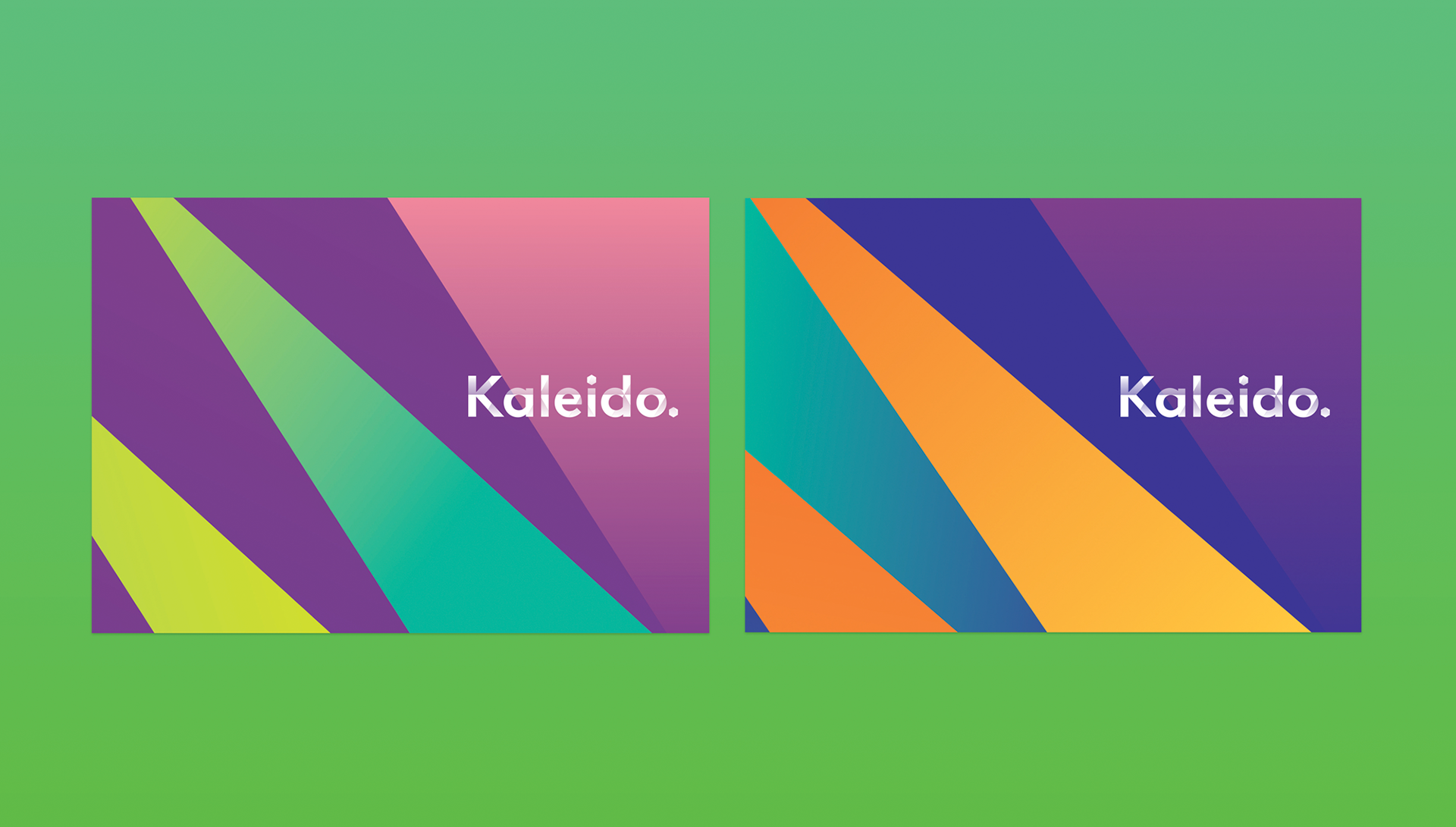
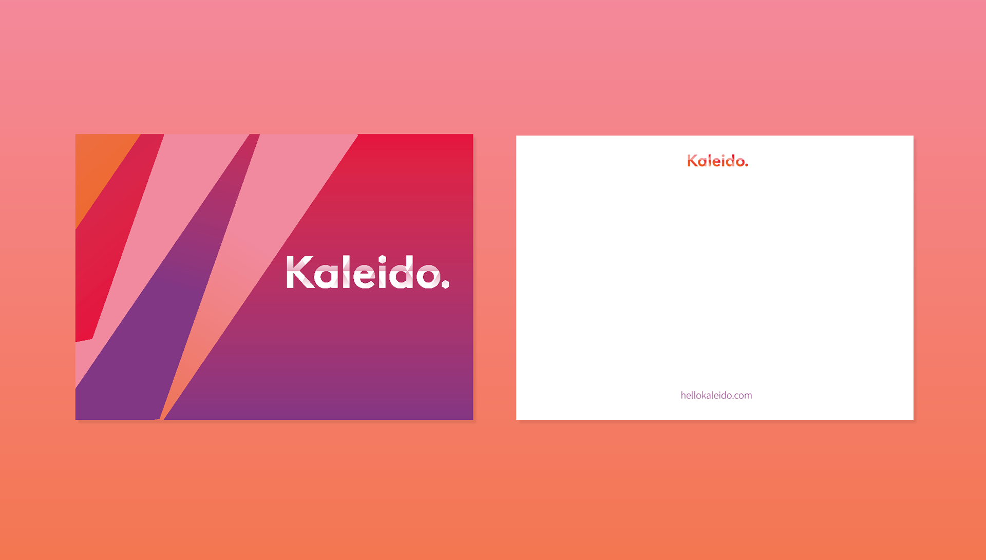
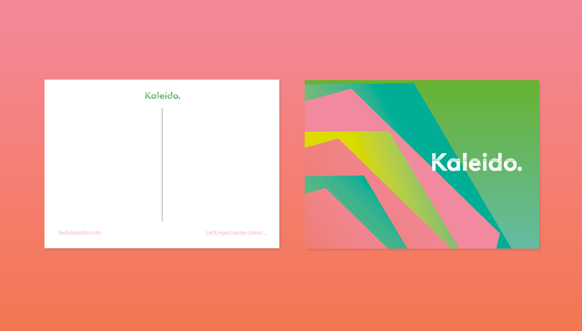
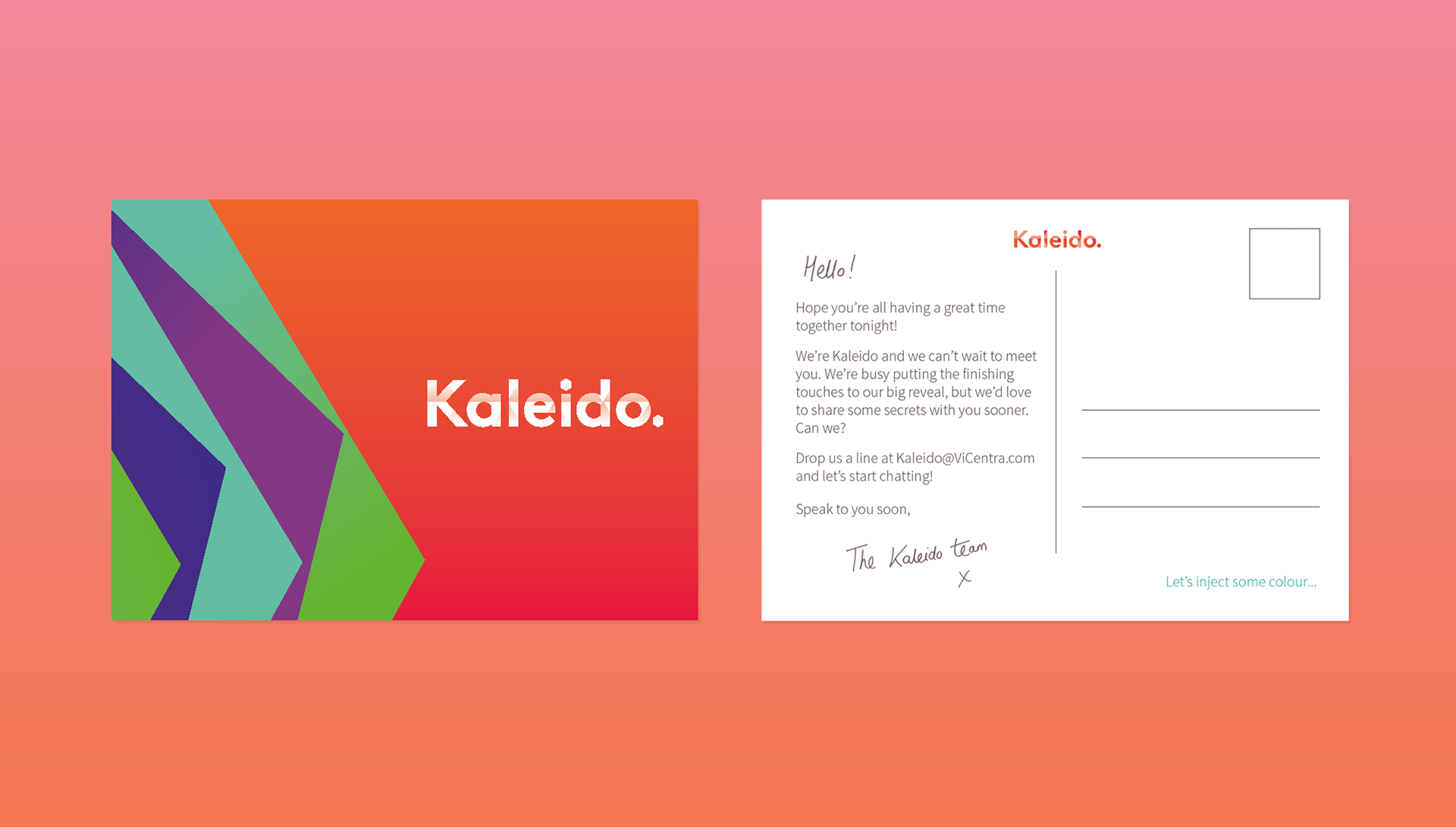
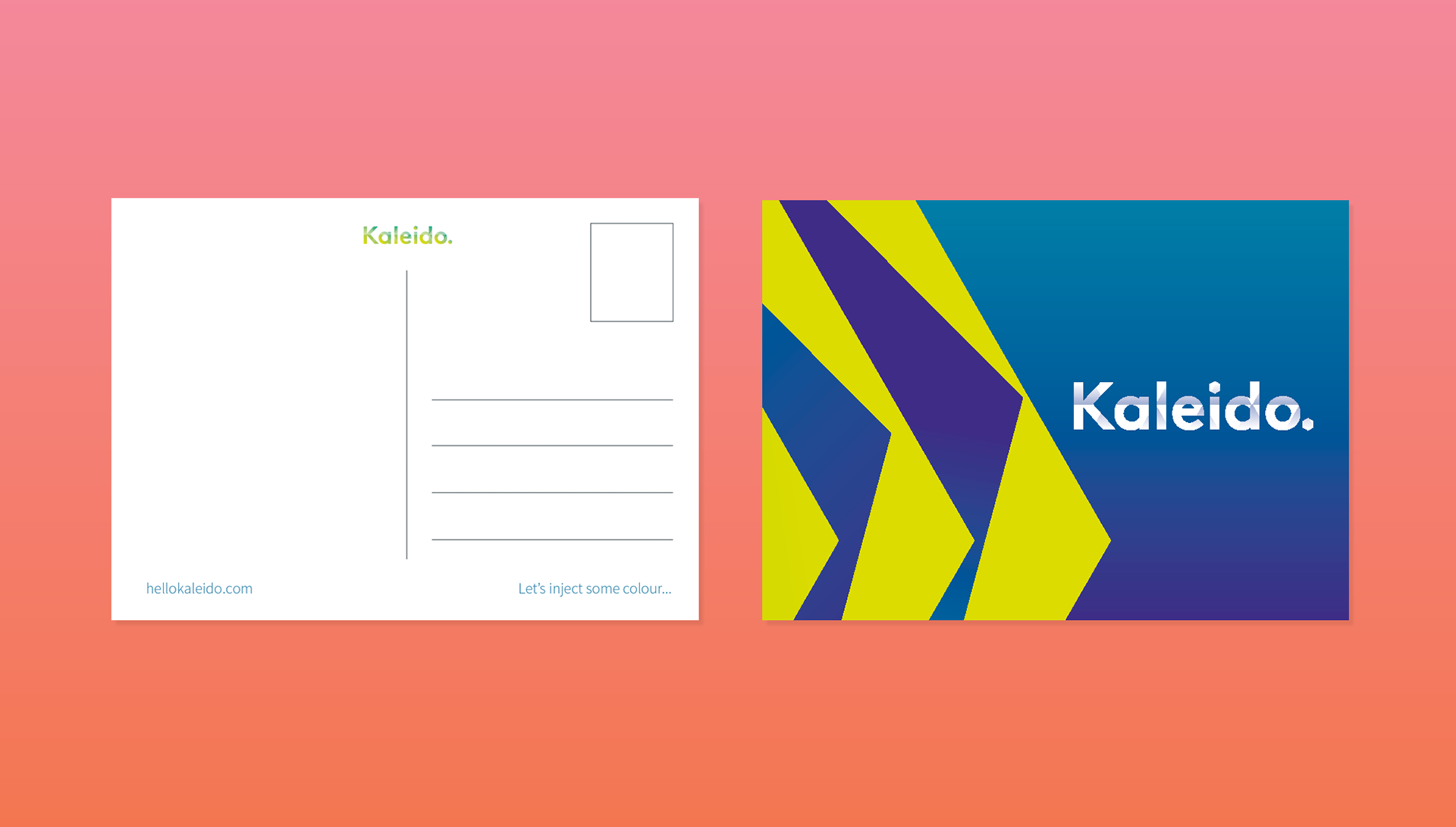
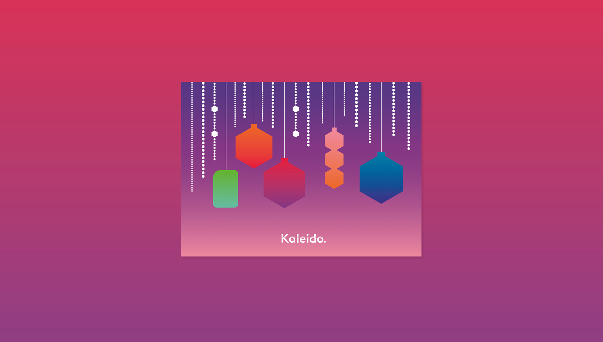
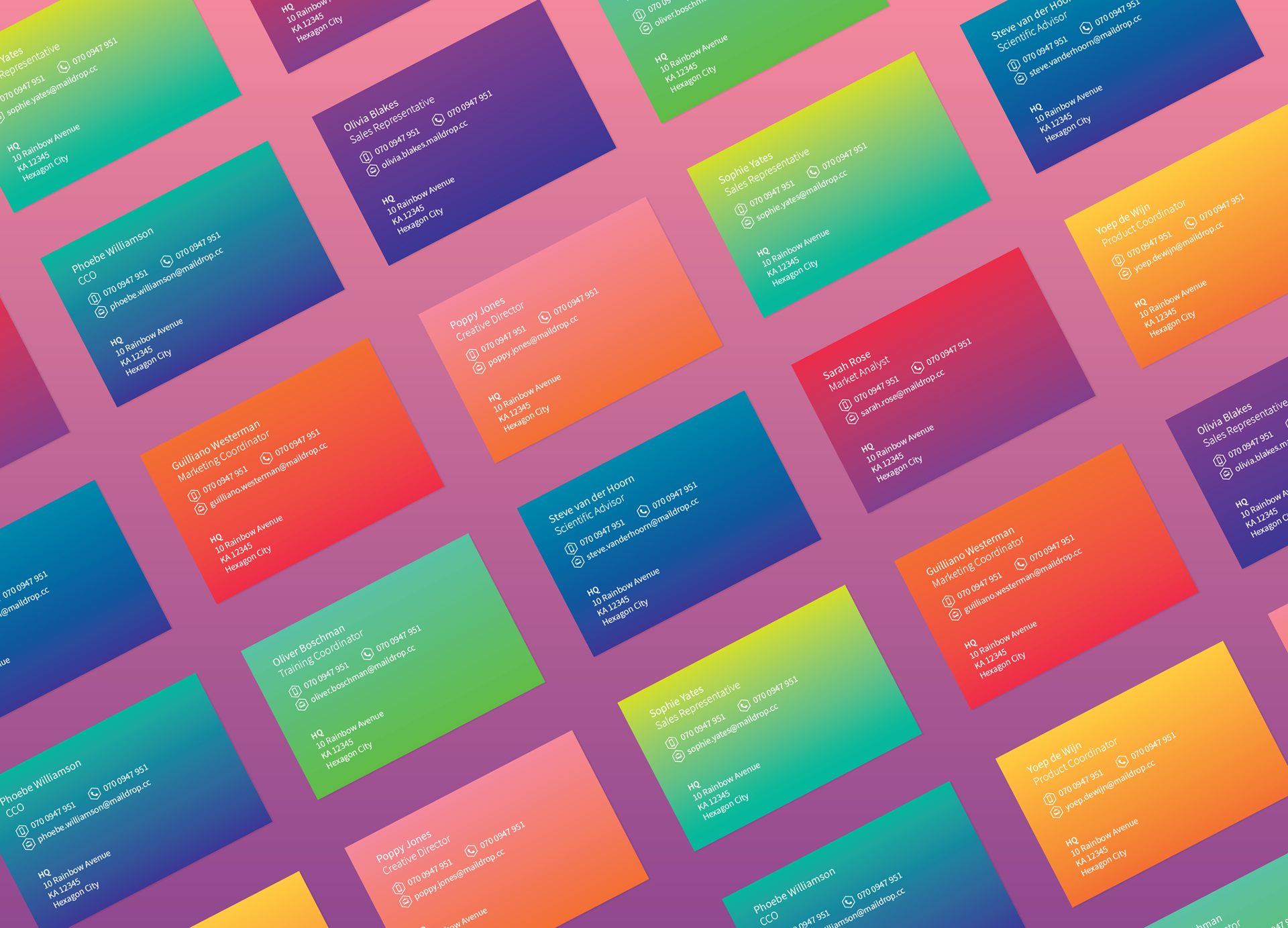
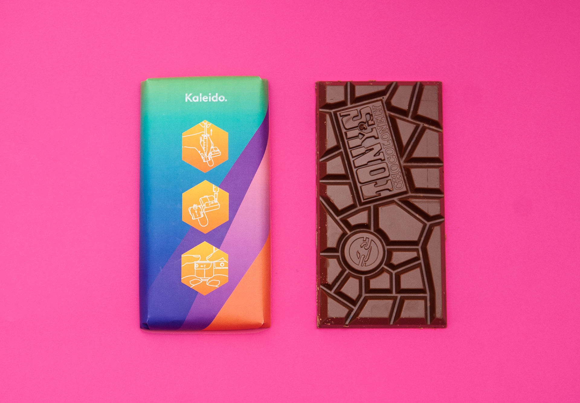
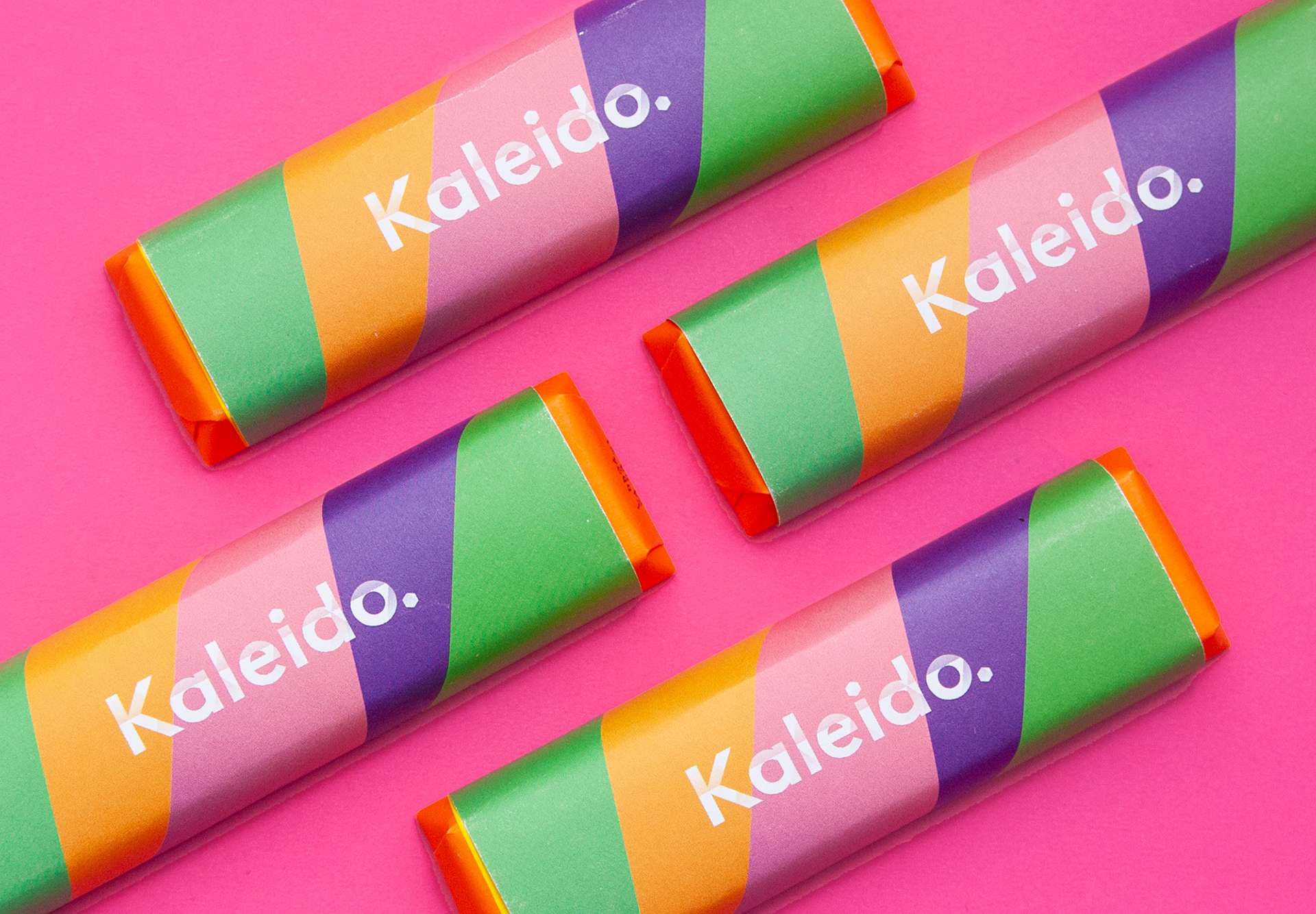
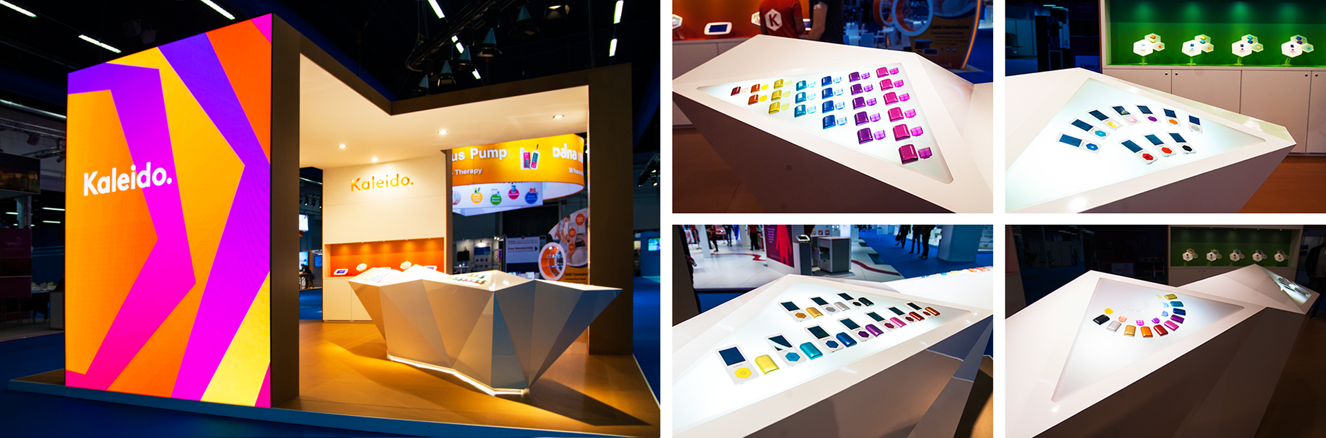
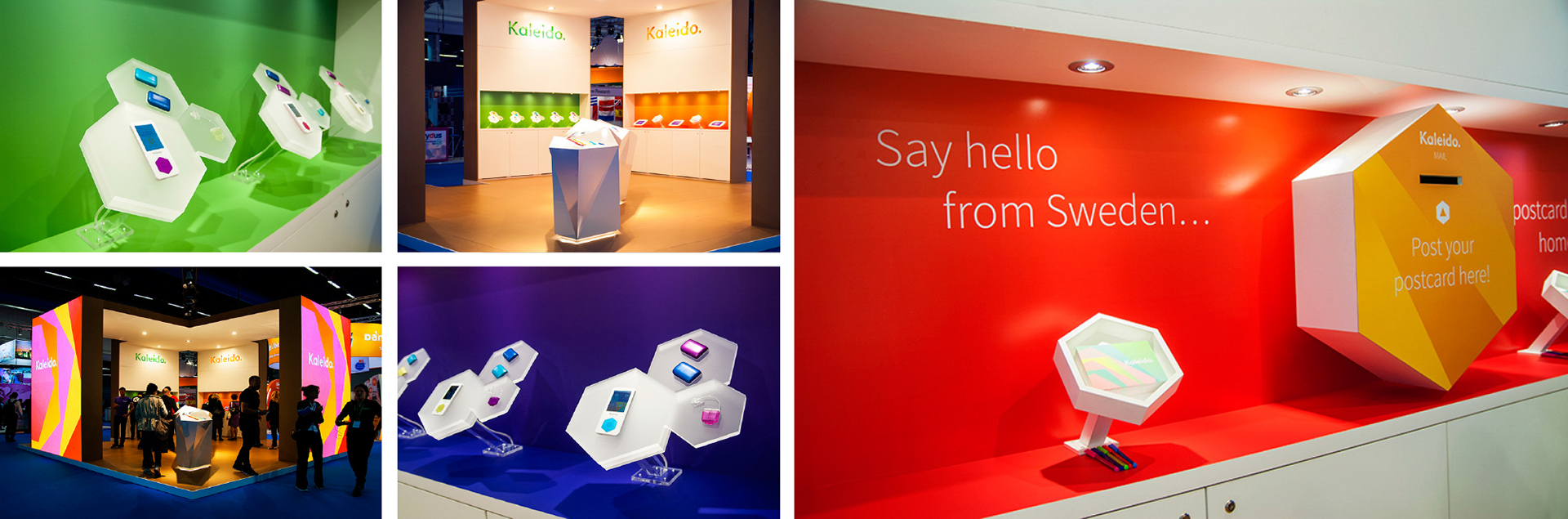
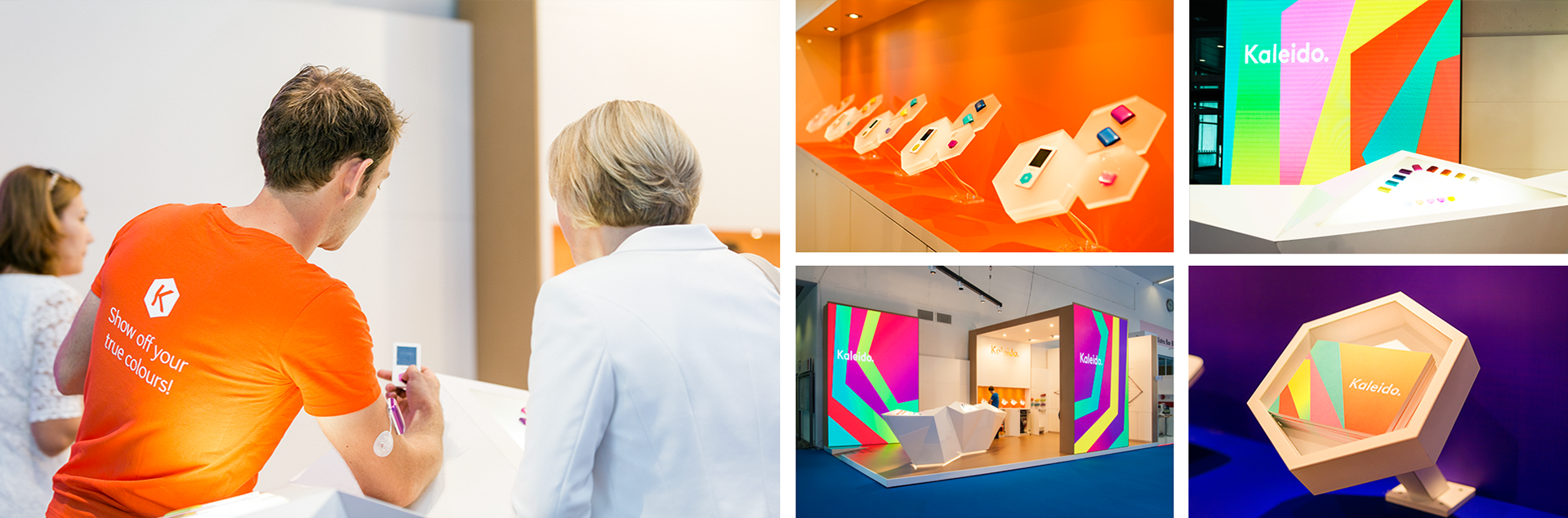
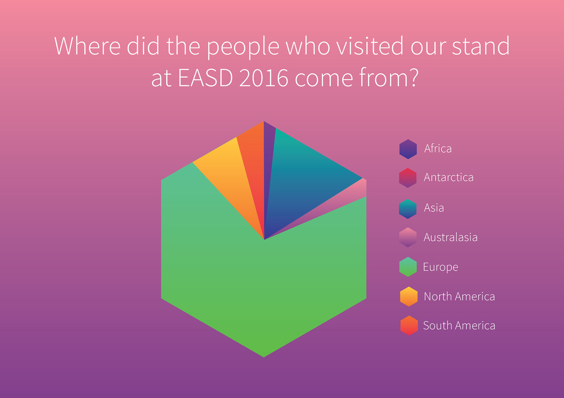
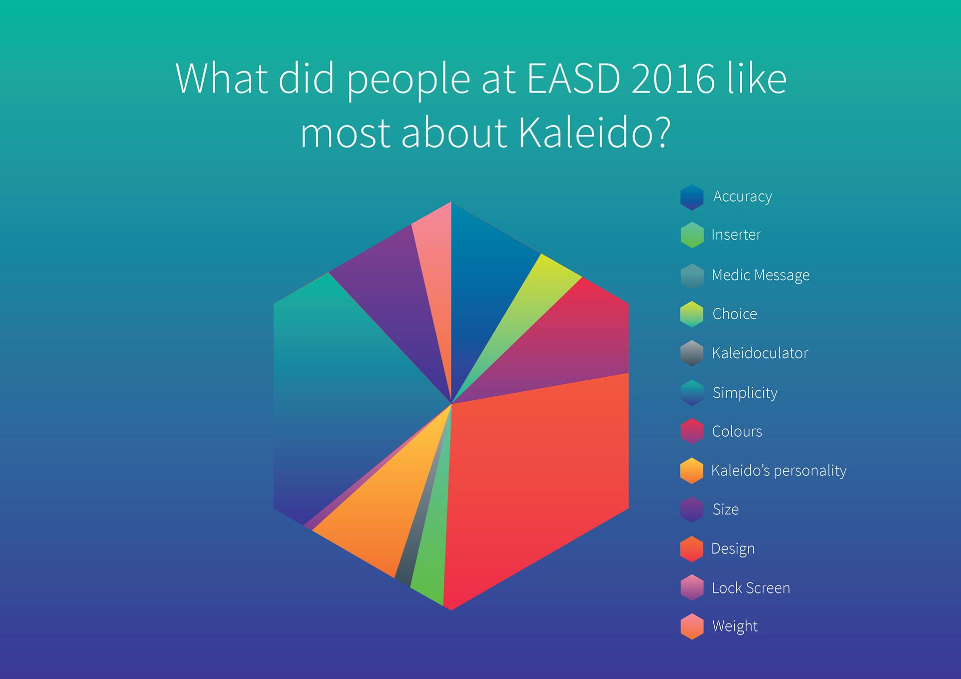
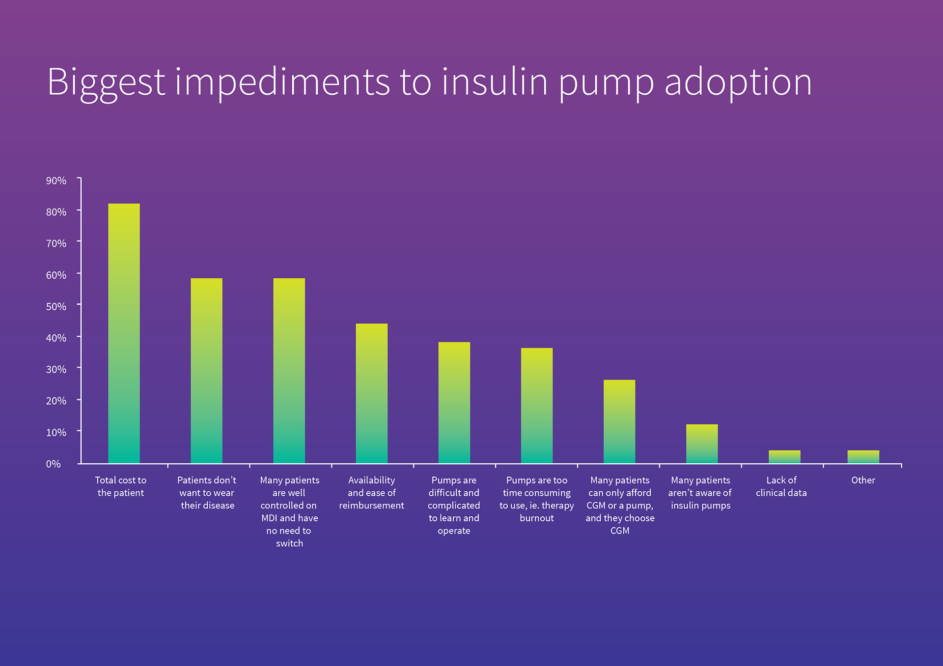
I designed the interface of the Kaleido handset, user instructions and a wide range of graphic materials such as postcards, business cards, magazines, brochures, giveaways and infographics. Kaleido was prelaunched and exhibited at the EASD fairs in Stockholm 2015 and Munich 2016, where I also created the product layout for the central table display, wall graphics, t-shirts and mailbox at the Kaleido stand.
Client ViCentra BV (in-house work)
Category Graphic Design, Print, UX, Events
Year 2014-2020
Category Graphic Design, Print, UX, Events
Year 2014-2020
Creative Direction Amy Oakes
Brand identity & iconography Nalla Design
Exhibition stand design WIT Design
Brand identity & iconography Nalla Design
Exhibition stand design WIT Design